AP STATISTICS
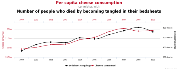
In our AP statistics class we learned how to distinguish good graphs from bad ones and how people use graphs/charts to mislead information to the public. Our class component was to find a chart that relates to our Fire Project topic but since I couldn't find a chart that relates to my issue I was able to choose another chart/table to help distinguish good tables/graphs from the bad ones. If you look at the graph one will see that that their is a clear correlation, a mutual relationship or connection between two or more things, between the two variables, but if you look closely at the variables one of the response variables(y-axis) per capita cheese consumption and the other one is number of people who died by becoming tangled in their bedsheets you will notice that these variables don't cause a causation between them or in other words one can't say that as years increases the per capita cheese consumption increases as well as the number of people who died by becoming tangled in their bedsheets. One can see that their is a linear relationship between both variables but one can't put both variables on the same graph because one varaiable doesn't effect the other.
